Drawing letters by hand again
Written byKwame Asanteon
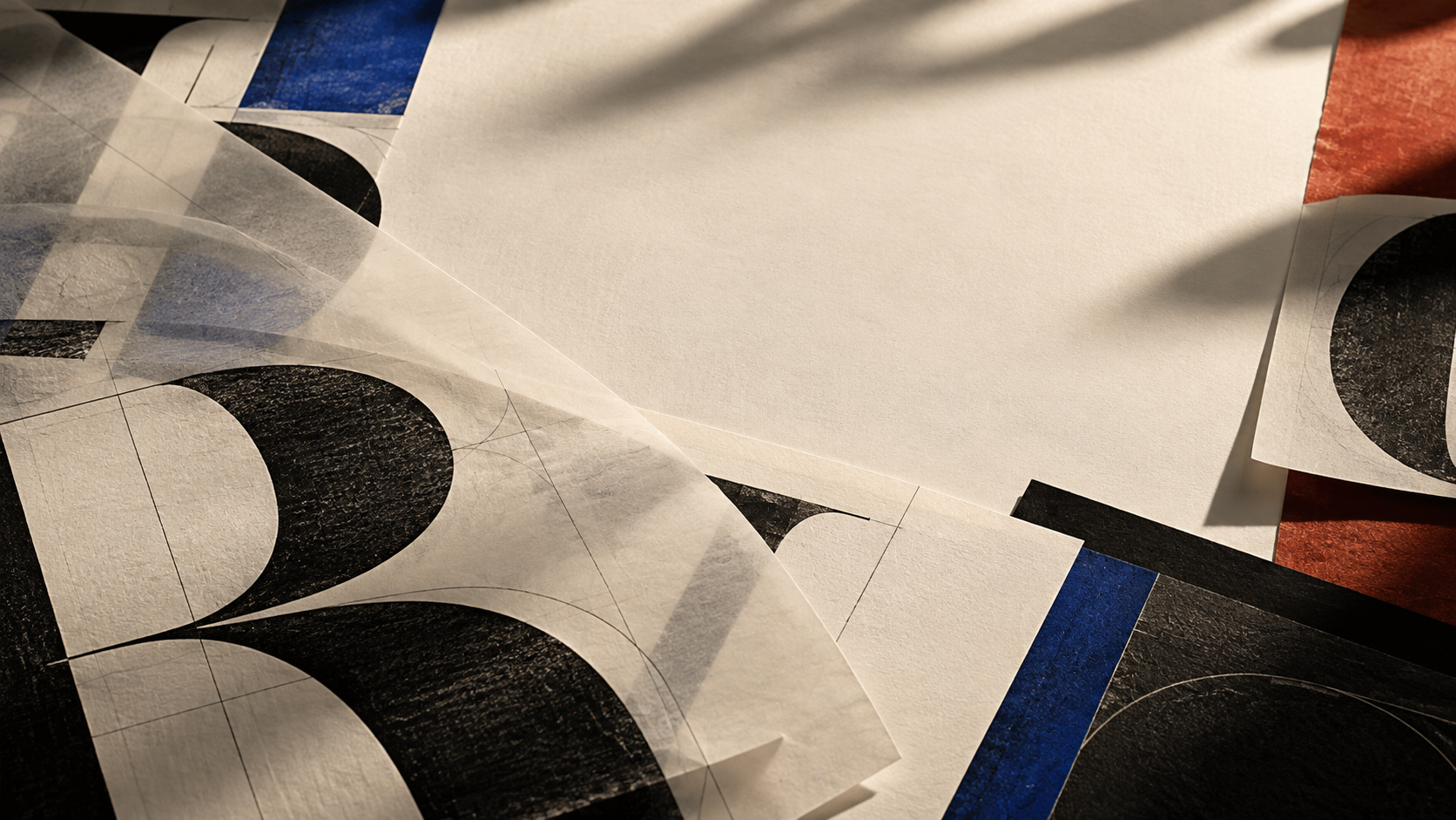
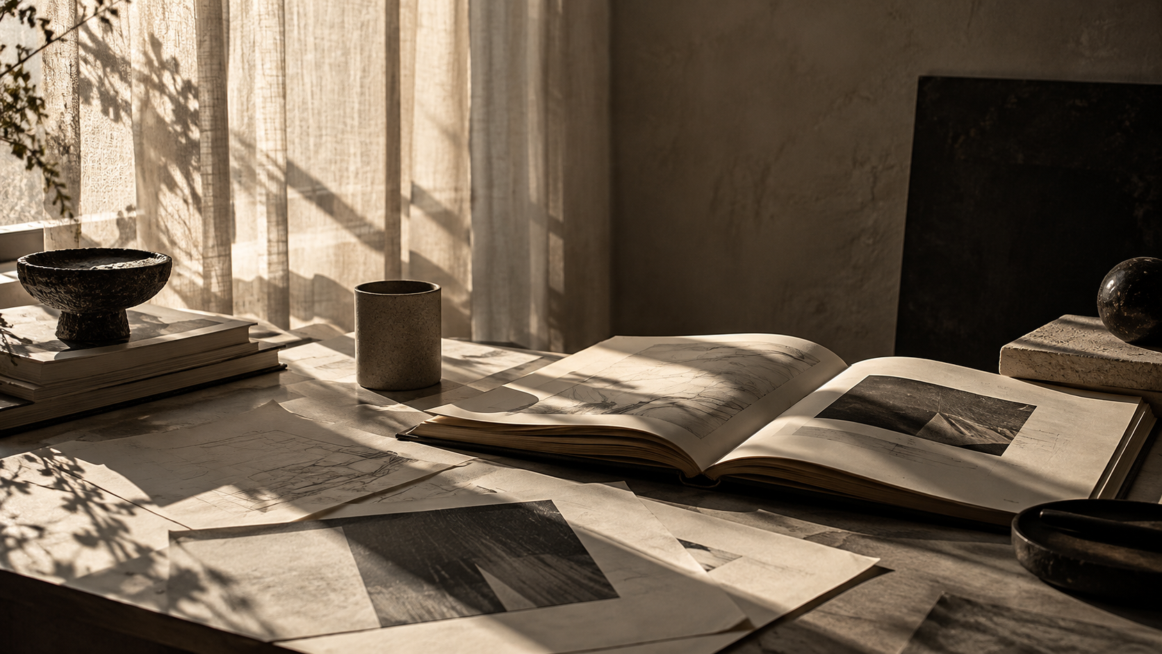
Before we open any type software, every identity in the studio now starts with a pencil, tracing paper and a very sharp knife.
A year ago we made a small rule: no letter gets drawn on a screen until it has been drawn on paper first.
It sounded nostalgic. It turned out to be the most practical change we have made to how we design identities.
The hand is slower
On screen, a curve can be adjusted forever. On paper, every line is a decision. Drawing slowly forces us to understand why a letter looks right, instead of nudging points until it stops looking wrong.
Tracing paper keeps the history
We layer sheets on top of each other, so every version stays visible underneath the next one. When a client asks why we chose a particular shape, we can show them the whole conversation, sheet by sheet.
Then the screen
Once the drawings feel settled, we scan them and refine every curve digitally, adding the spacing, the weights and the details a working typeface needs. The hand gives the letters their character. The software makes them reliable.
The result is lettering that feels made by someone, rather than chosen from a menu. And clients notice, even when they cannot say exactly why.