New work: Ferro Coffee identity
Written byKwame Asanteon
A compact, confident identity for a Riviera roastery, where one colour marks every roast and one line of type tells its story.
Ferro Coffee came to us with a familiar problem: a business that had grown faster than its brand.
Twelve farms, five roasts, dozens of cafés, and packaging that had been designed one coffee at a time. Every bag looked slightly different, and launching a new lot meant weeks of back and forth with the printer.
One mark
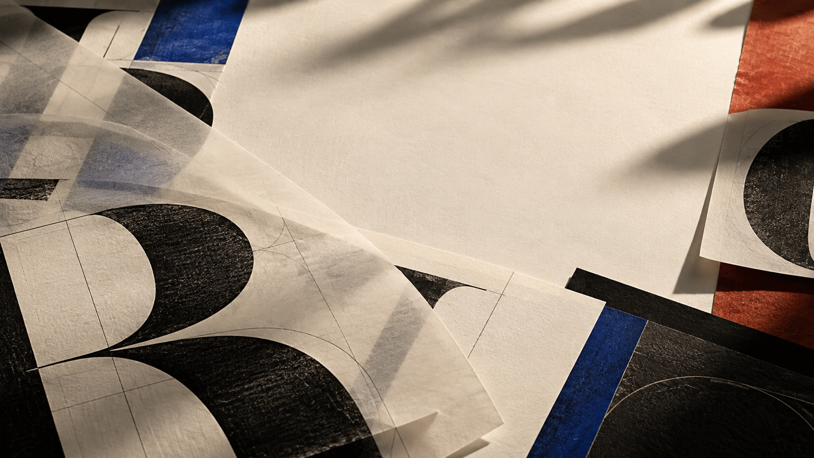
We drew a compact, heavy wordmark that holds up at every size, from a sticker on a takeaway lid to the sign above the roastery door. It is dense enough to print on kraft paper and bold enough to read from across a café.
One colour per roast
Instead of a new design for each coffee, every roast now has its own colour. Light, medium and dark sit side by side on the shelf like a gradient, so customers learn the system without being taught.
One line of type
The farm, the region and the tasting notes live in a single typographic line. The roastery team can set it themselves in minutes, which means a new coffee can be on the shelf the same week it arrives.
The identity launched this spring, alongside a new online shop and a refreshed roastery in Antibes.